IUCN Red List
Redesign of the website to make access to conservation data intuitive and approachable
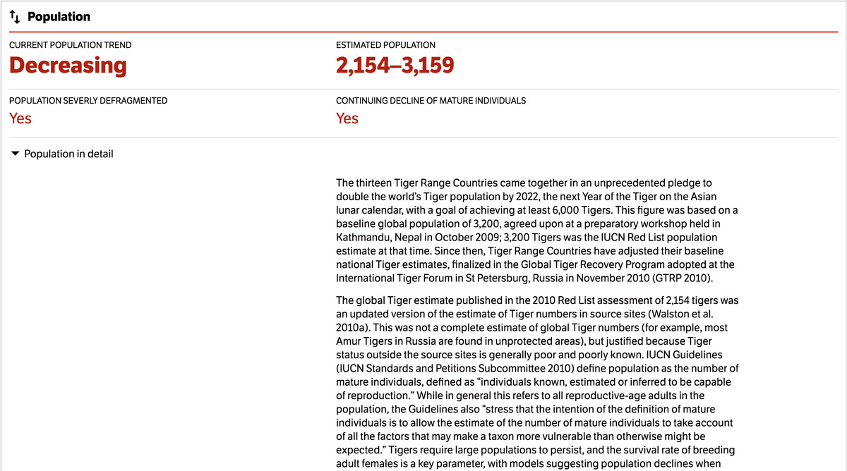
Surfacing practical, insightful data
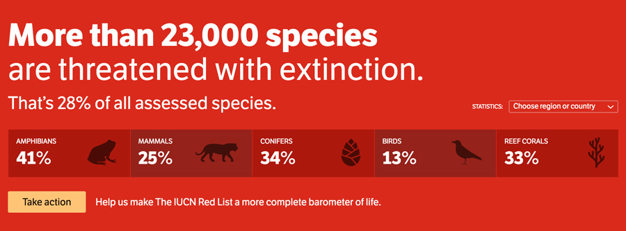
The IUCN Red List of Threatened Species is the most comprehensive inventory of the global conservation status of biological species. It is the definitive record of whether a species is, for example, endangered or threatened with extinction.
I worked alongside Modern Human, a consultancy, to determine how the IUCN Red List website (built ten years ago) could serve a broader audience and take advantage of modern web technologies.
Modern Human began their research by speaking with and observing zoologists and conservationists, a core user group. They met with teachers to learn how information is used in teaching materials, and with stakeholders to understand what data is critical to conservation funding. Their research produced a design concept that led to the development of the website.
The redesign meets the needs of a diverse user group: naturalists, conservationists, academics, journalists and teachers. It summarizes critical data while still providing intuitive ways of finding detailed information.
Distilling an identity
In evaluating the brand identity, we found that the guidelines predated digital and web applications. Without scope to do a full rebrand, we focused on the identifiable aspects of the identity: color and typography.
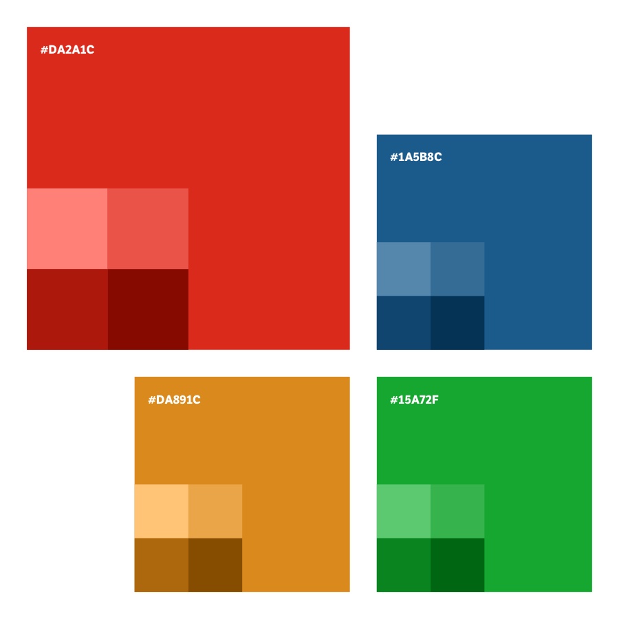
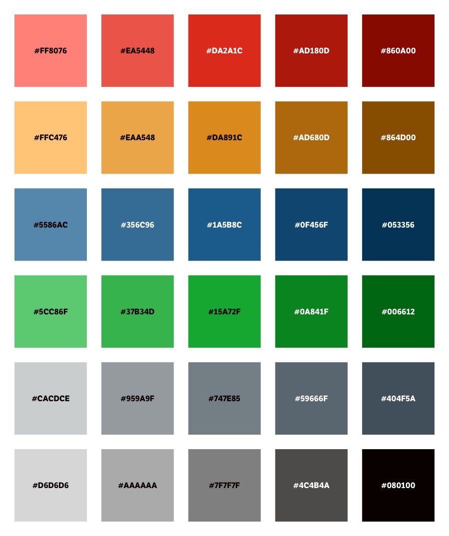
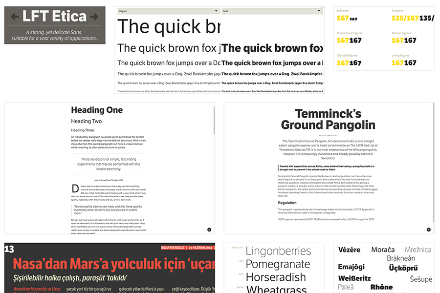
More than anything, the color red defined the brand. I extended it with a range of tints and shades, and complemented them with secondary and greyscale colors. I chose LFT Etica, a humanist sans serif, for the typography. It is a contemporary interpretation of Helvetica Neue (the preferred typeface of The IUCN Red List), but suitable for digital.
Presenting a visual direction
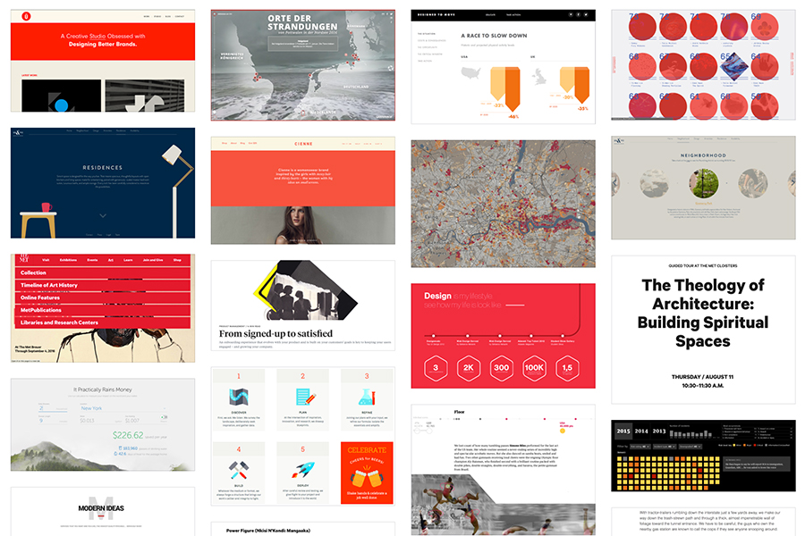
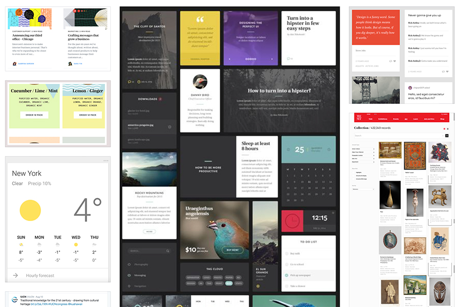
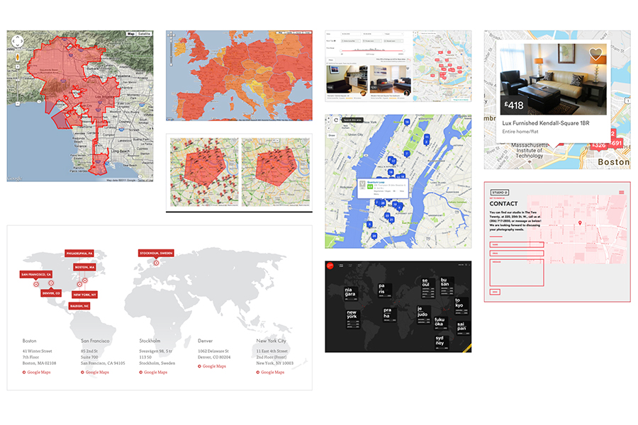
Along with the color and typography, I put together image collections to convey the intended style and mood of the website's visual direction. I included both prominent and understated examples of color, form controls, polygonal maps and display patterns.
Agreeing to a visual approach at the start allowed me to start designing components that would become the building blocks of the website, while Modern Human produced wireframes that began to address the arrangement of information.
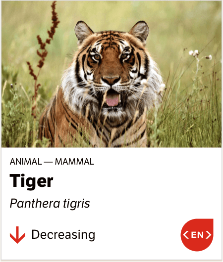
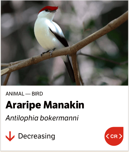
Designing display patterns
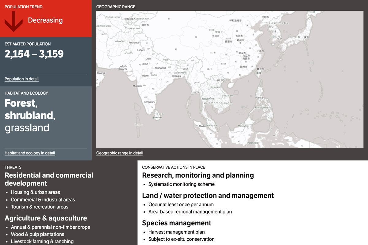
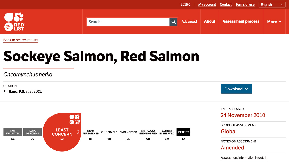
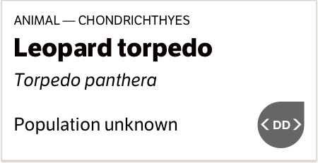
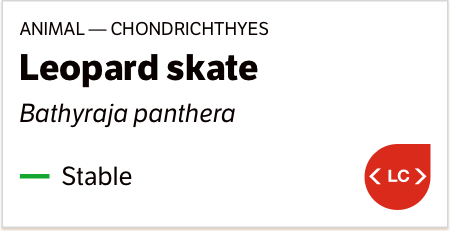
The IUCN Red List contains assessments for tens of thousands of biological species. For each species, a record exists with an official threat classification, backed by the research and contributions of a global group of experts. Interpreting this data and making it available to users with different needs was the central challenge we faced.
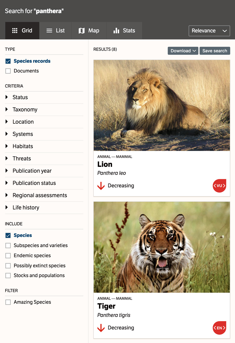
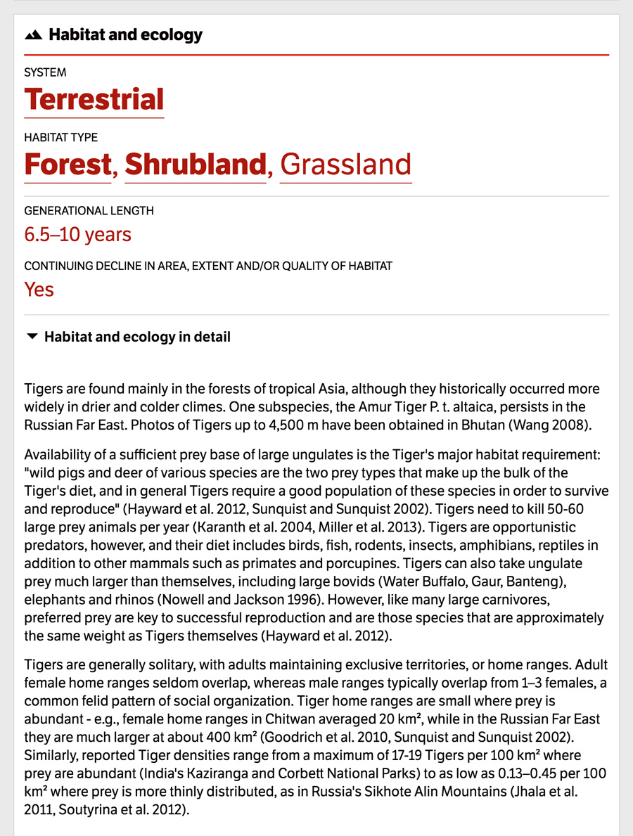
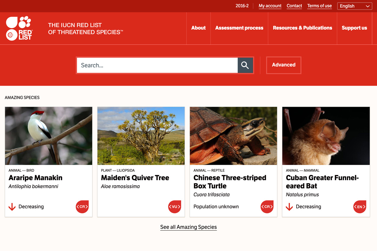
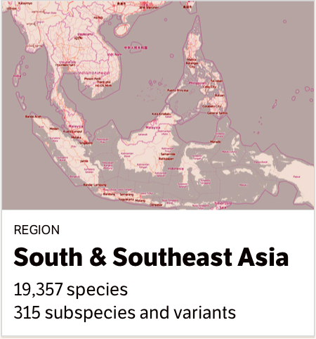
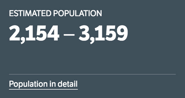
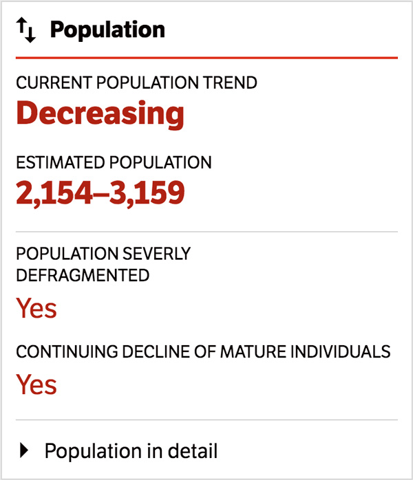
Search is the foremost way of finding a species assessment. We needed to strike a balance between the simple task of discovering an individual assessment, and advanced queries that group species by criteria such as location, habitat, threats or taxonomy. A species record faced a similar challenge: how can critical facts be summarized and presented above in-depth research?
The solutions to these questions were broken down, in the interface, into smaller, reusable components. I started with search results, and the faceted controls to filter them. For a species record, I explored short and full views of research topics, and facts panels.
By anticipating a modular system, I could address questions of incomplete or outlying data early on: a search result without an image, a long species name, or multiple search criteria within a deep hierarchy. The patterns were prototyped and their relationship with supporting elements tested.
Next: Building templates
Building templates
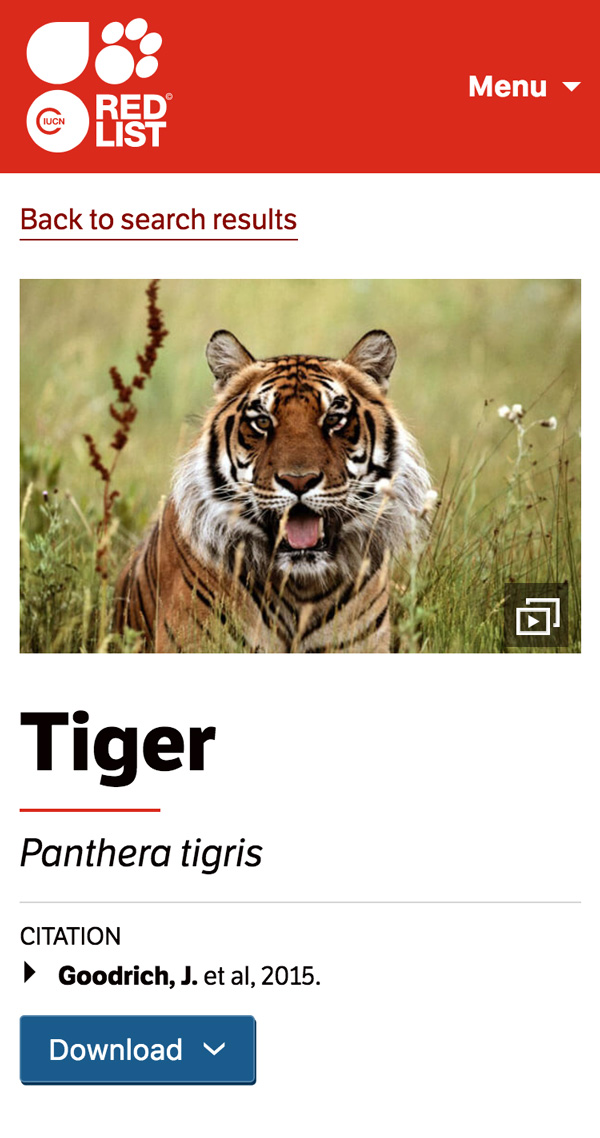
The species assessment screen was designed around data compartmentalization, which made it possible to prioritize high-level facts and link them to a research topic. The templates that group the patterns were reused for other content screens, matched with other patterns.
By designing modularly, it became natural to think of patterns, like the search results, as objects that could be viewed through different windows: as a grid, a list, on a map, or featured on the homepage. Made of basic components like a title, subtitle, metadata and image, the display pattern could also be reused for documents, news, regions, or threats.
I designed templates for a dozen different content screens and their variations. I developed the front-end and delivered static files that the organization could use to integrate with their proprietary back-end.