Snyk
Branding and interface design for the security startup to bring its product to market
Offering security for developers
Snyk is a security startup based in London and Tel Aviv. They offer tools for developers to detect and fix vulnerabilities in apps. At the heart of their product is a command line (CLI) tool that monitors code dependencies.
Forming an identity
I started with Snyk as the CLI tool found a stable release and was beginning to attract users. The startup had a website to complement the CLI tool, but it was minimal and provided only basic information about users’ projects and a database of vulnerabilities. The product had a logo, but nothing in the way of a brand or user interface.
To understand how the startup saw itself and its product, I spoke with members of the team. From these conversations, I put together a list of words — core values — that would inform my typography and color selections. I chose a typeface that matched the tone of the words, and created an extended color palette with appropriate associations and meaning. Snyk’s logo was well-illustrated and distinctive, so I changed only the wordmark, remaking it with the new typeface (Prenton).
Next: Defining patterns

Defining patterns
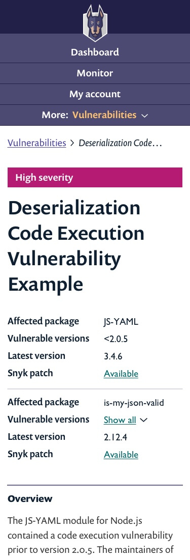
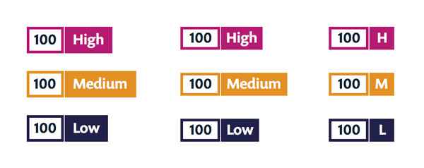
The next step was to design components for the website’s user interface. I took an inventory of interface elements already in use, like badges, counters and labels. I then added common requirements, such as buttons and form controls.
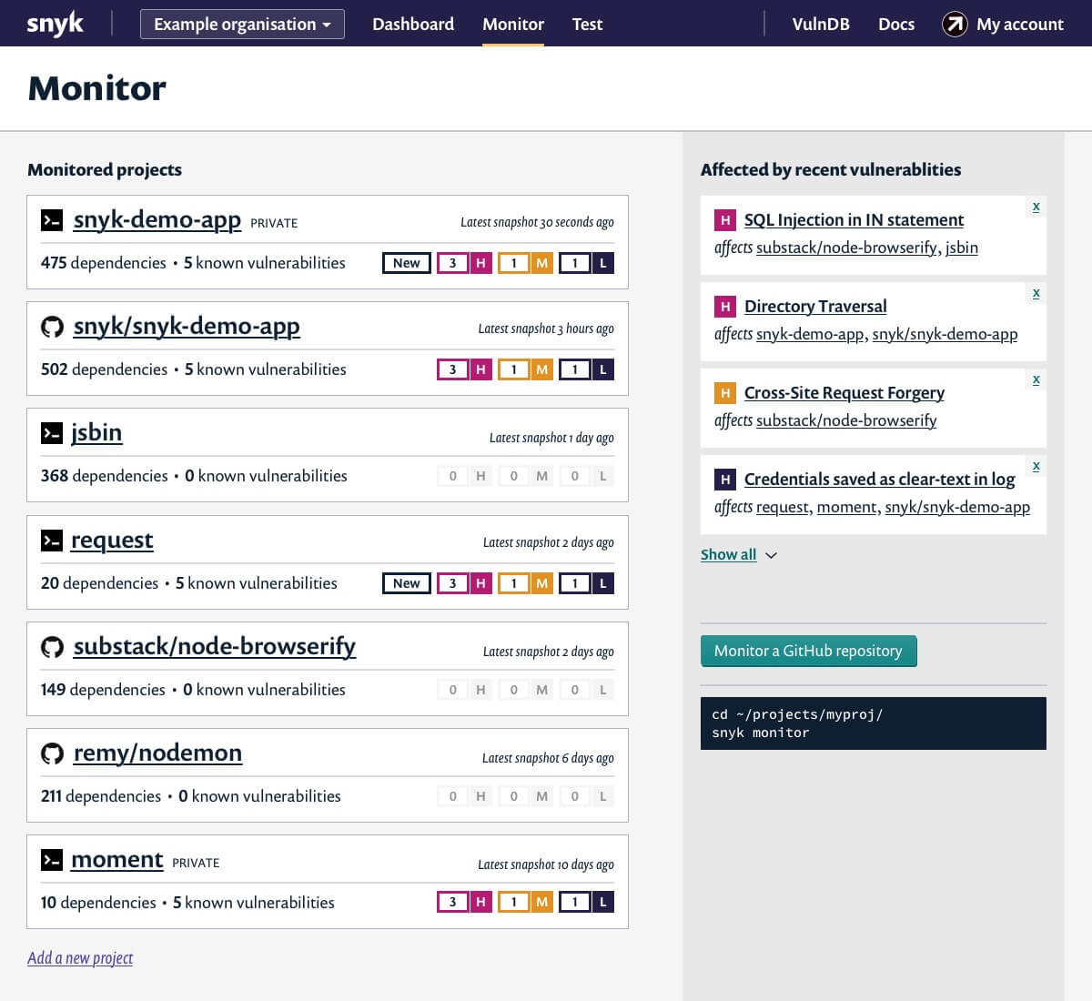
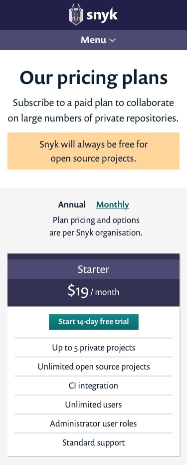
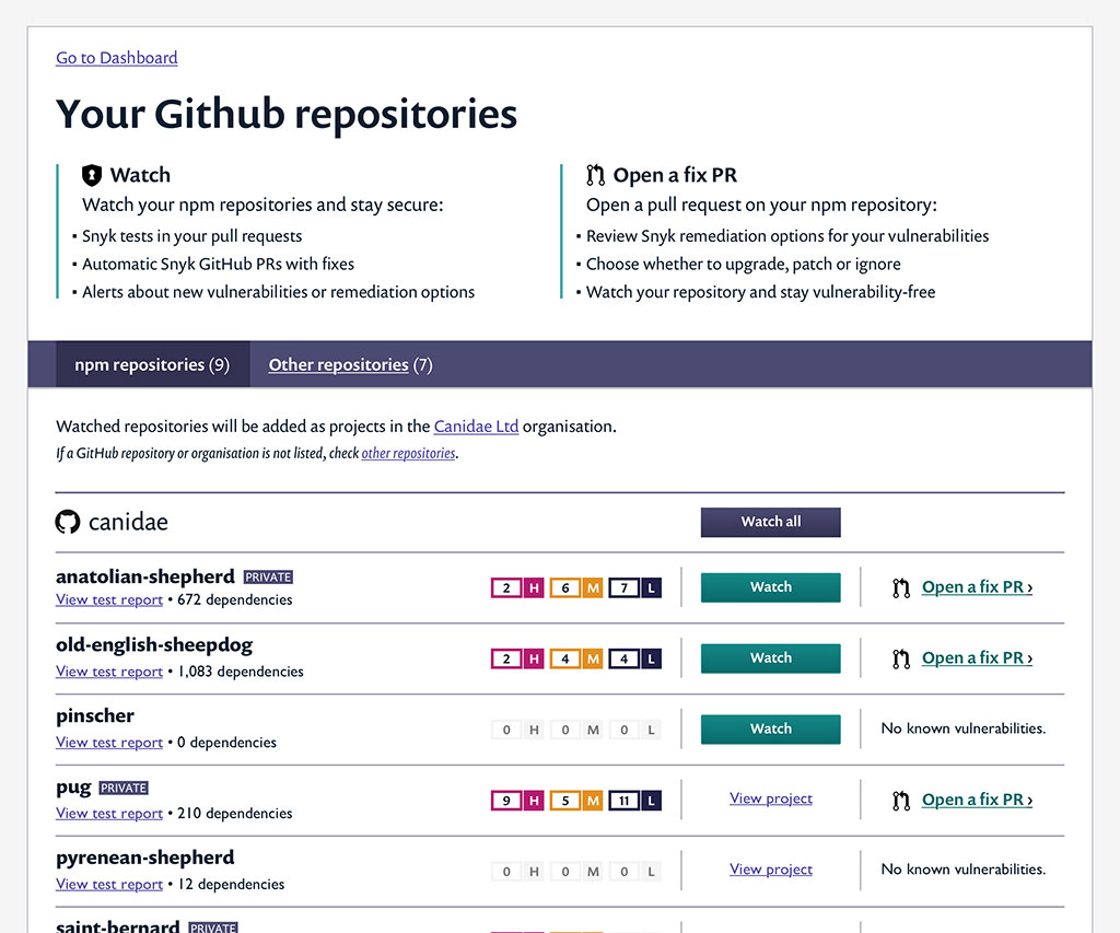
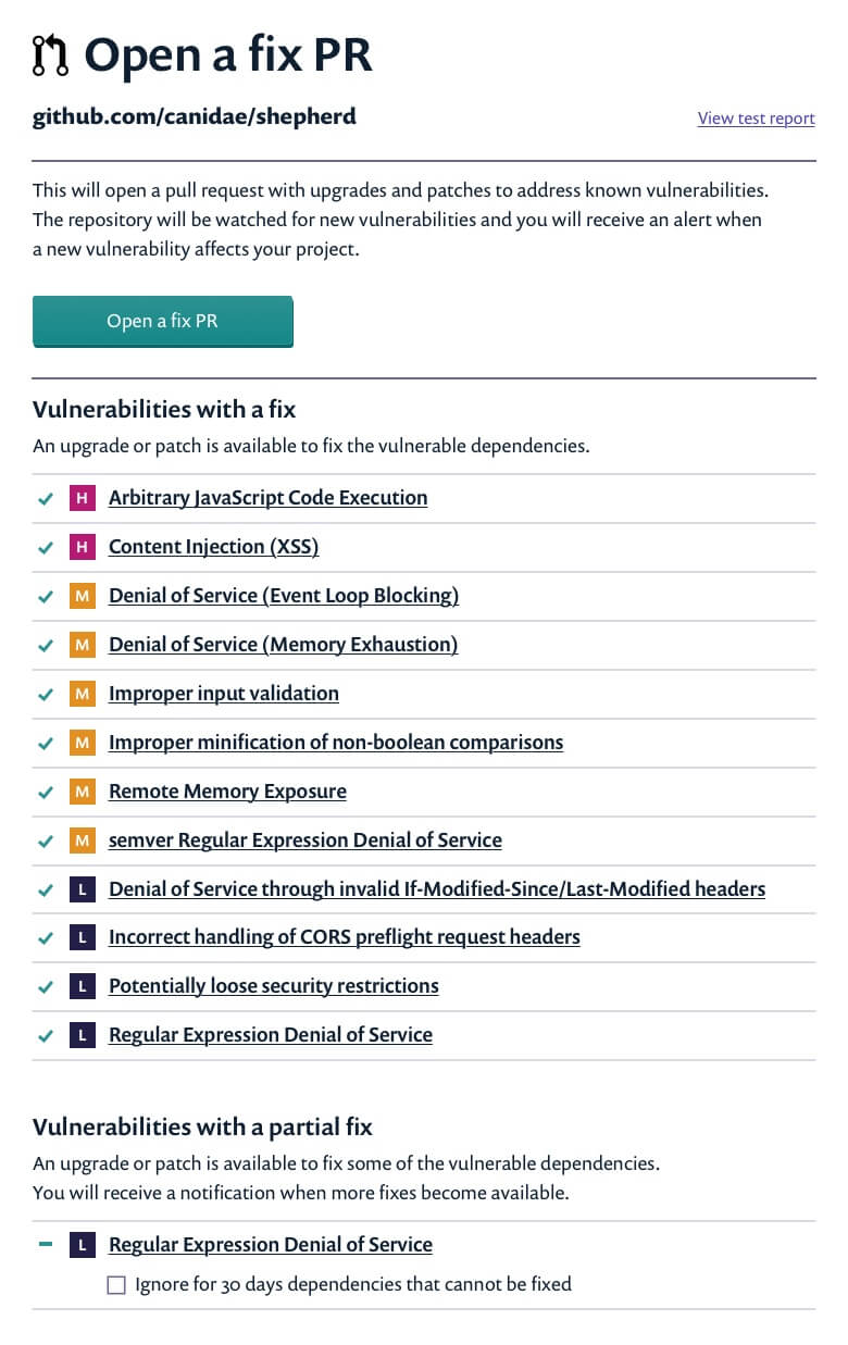
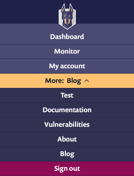
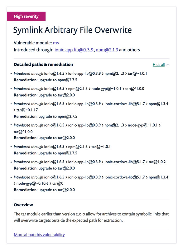
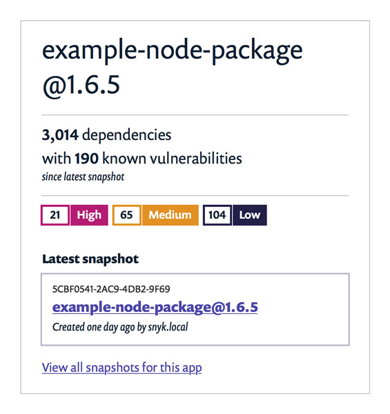
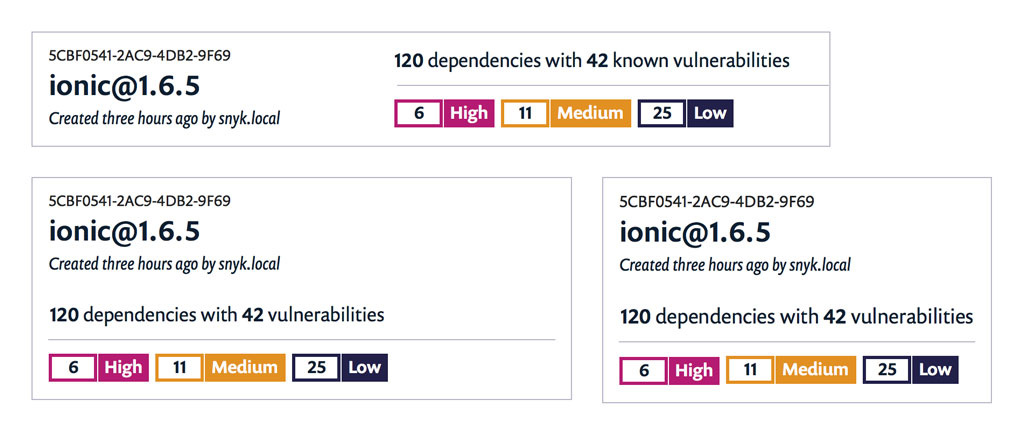
Using the new components, I built display patterns, from basic objects like checkbox filters and tabbed navigation, to complex but modular patterns: content cards, responsive navigation, pagination and collapsable nodes.
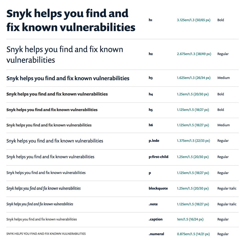
I delivered a typography guide, which described a hierarchy of font sizes and weights, and included examples of usage. The front-end developer added the components and patterns to a living style guide, and to the website as needed.
Next: Building a product




Building a product
A short time later, I returned to the project to continue design work on new patterns and pages, and to bring the product website out of beta. This lasted six months.
Following a product roadmap, I added to the interface and iterated on existing elements as the team gradually introduced new features. I split my time between designing and implementing the front-end (integrated with a Node.js back-end), each informing the other. Product development was fast-moving and fast-changing, and required tight collaboration with the other developers and the product owner.
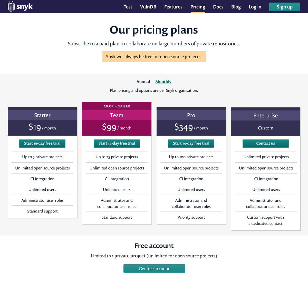
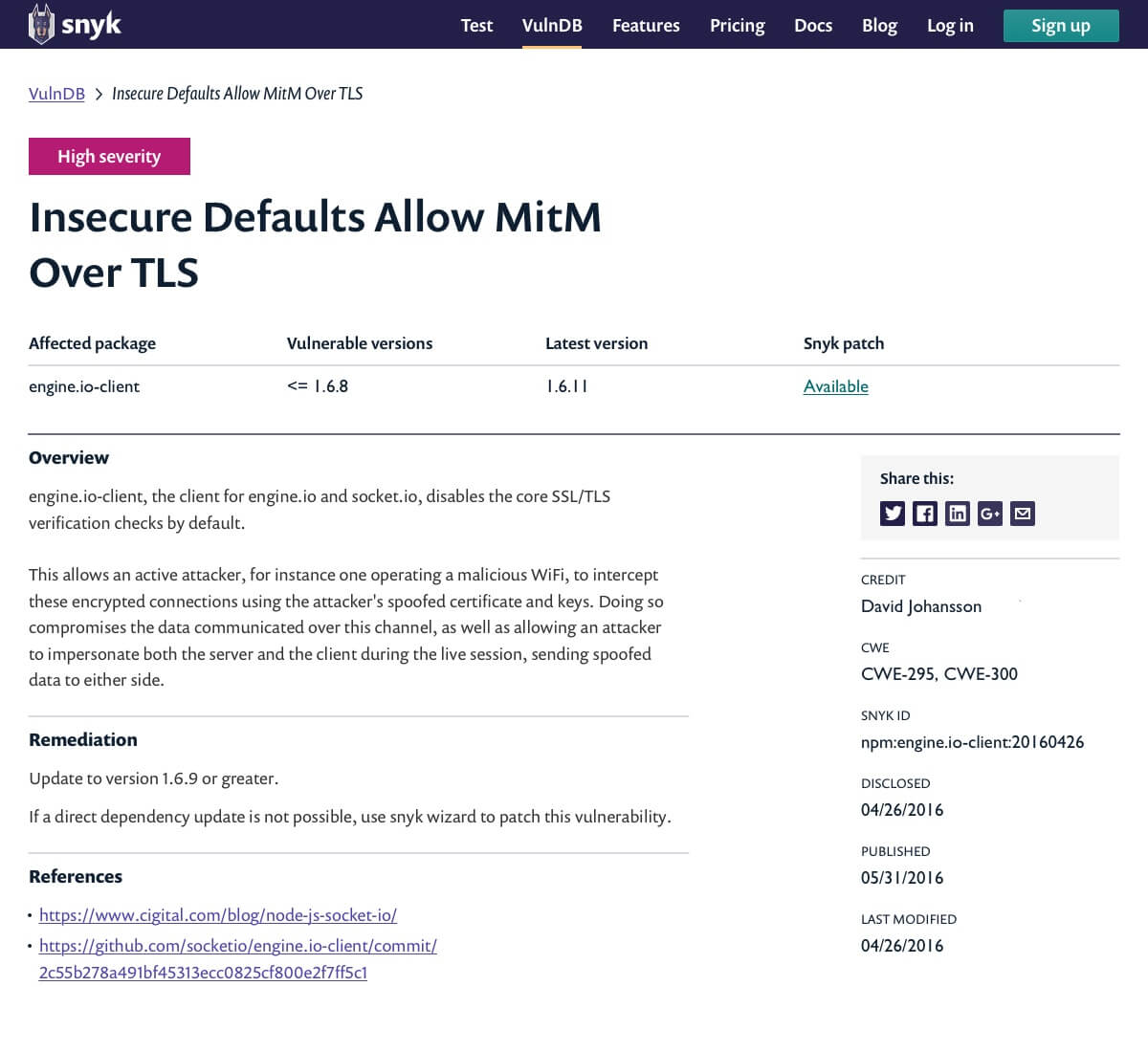
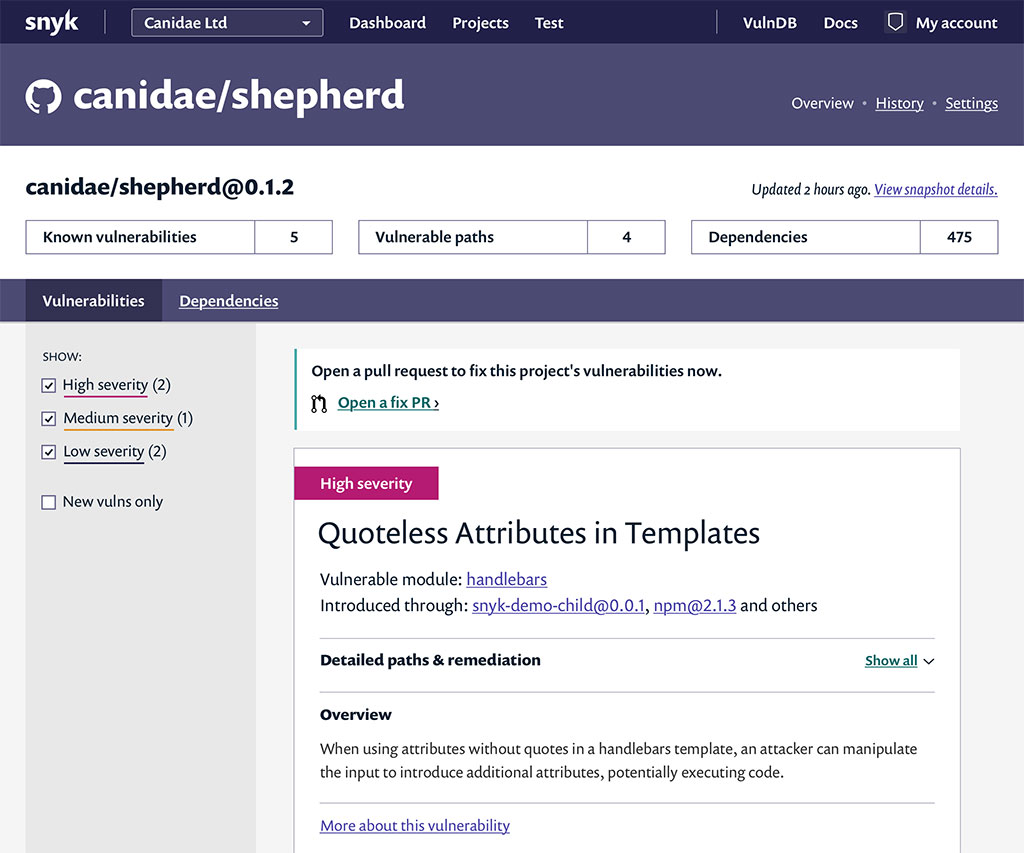
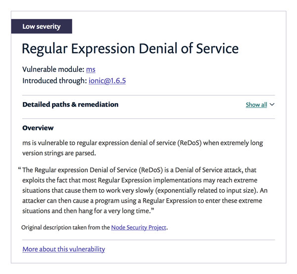
The focus of the work was largely on the experience of the website once a user had authenticated: a dashboard, project pages, organizational management, adding and removing code repositories. However, I also helped grow the side of the website that marketed to new users with a new homepage and areas for product features, testing, and pricing plans.
The product moved successfully out of beta with a revenue model, and the billing integration needed to support it.
