twoVeg
Branding and design of a website to showcase London's best vegetarian and vegan places
Discovering new places to explore
twoVeg is a side project I run with my partner, Kate, an editor and content strategist. The website is our guide to London’s vegetarian and vegan places. It is built upon our exhaustive research and first-hand experience.
Finding a niche to fill
There are lots of vegetarian and vegan places in London and while new places are always opening, many have closed. The project came out of our interest in knowing what places were around, and sharing the best of them with others. Our goal was to make something that we would use ourselves, as vegetarians.
We saw a niche between user-generated websites and lists curated by magazines. With the former, it often happens that the list is so broad that it’s hard to narrow down choices. Entries are routinely out of date or inaccurate. The lists published editorially are better quality, but infrequent and short in scope.
Putting it into words
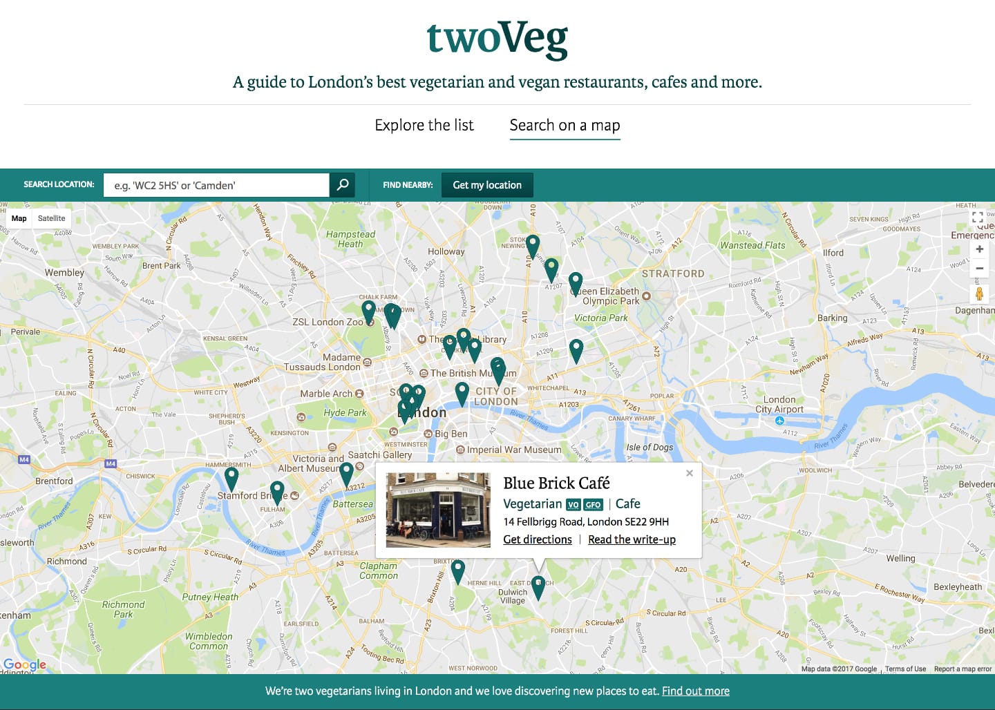
We first considered what information users would be interested in and how they would access it. We defined the information architecture and prioritised functionality based on our assumptions, which we would later test. We wanted to provide different ways of discovering content.
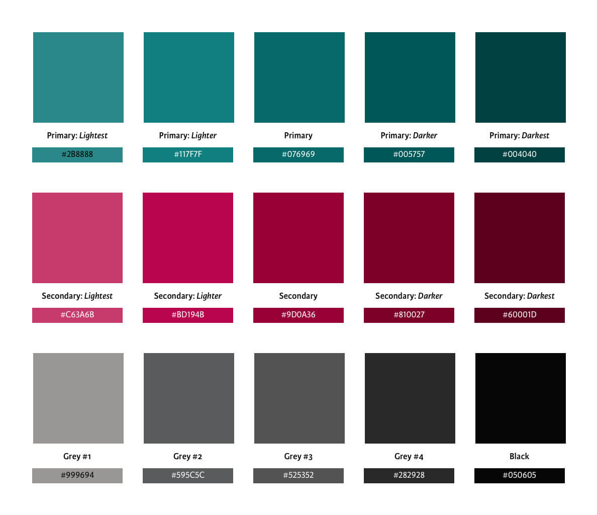
We defined our mission and made a list of the core values we hoped to embody and convey as a brand in our visual, written and spoken communication. From this, I chose a typeface (Karmina) and color palette, and created a wordmark. Kate developed our content strategy, tone of voice and house style, which informed the interface language.
Next: Researching the options
Researching the options
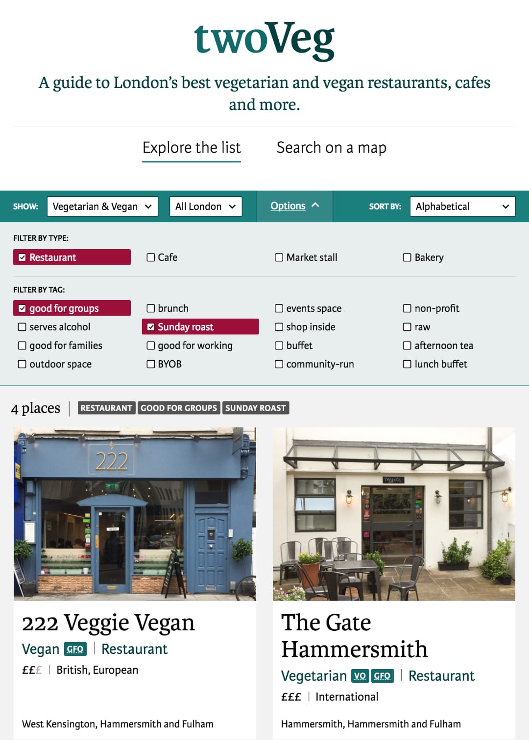
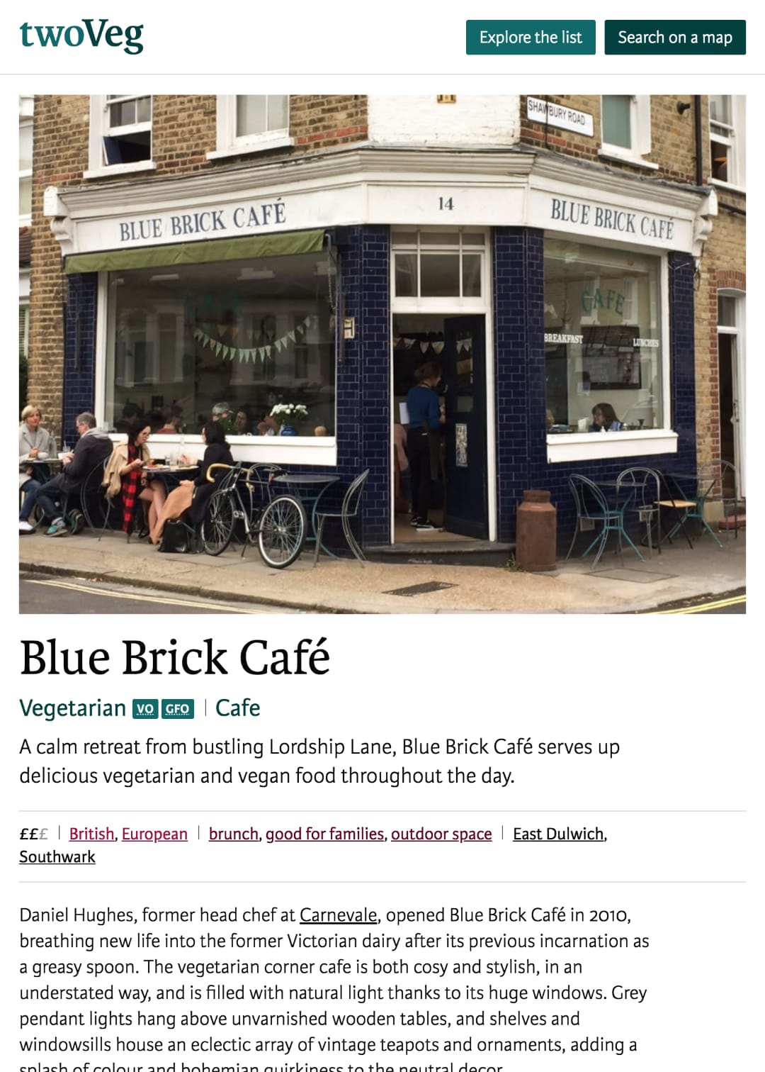
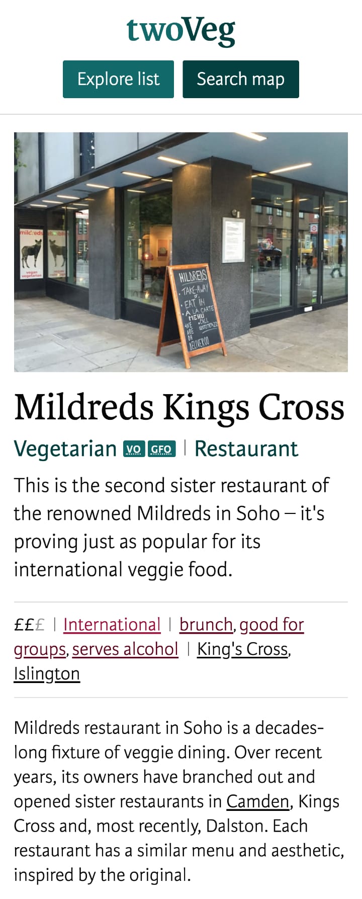
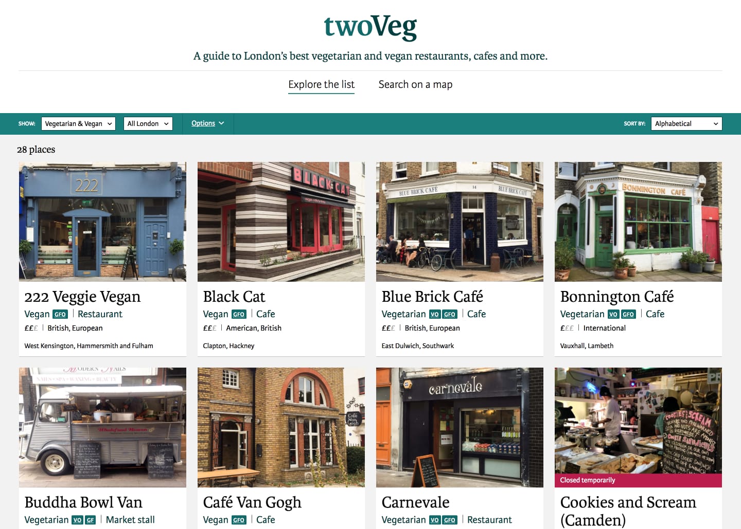
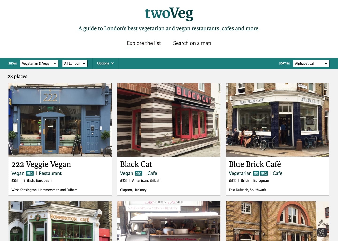
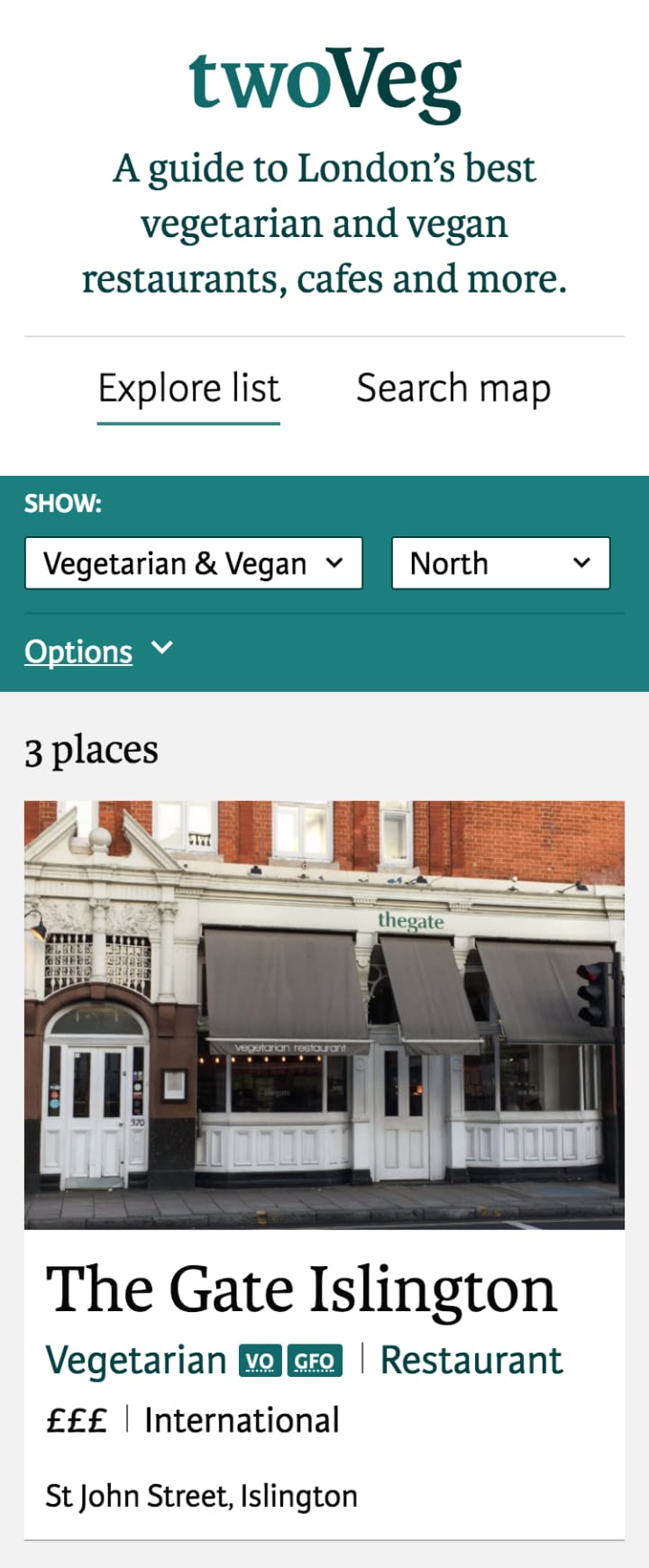
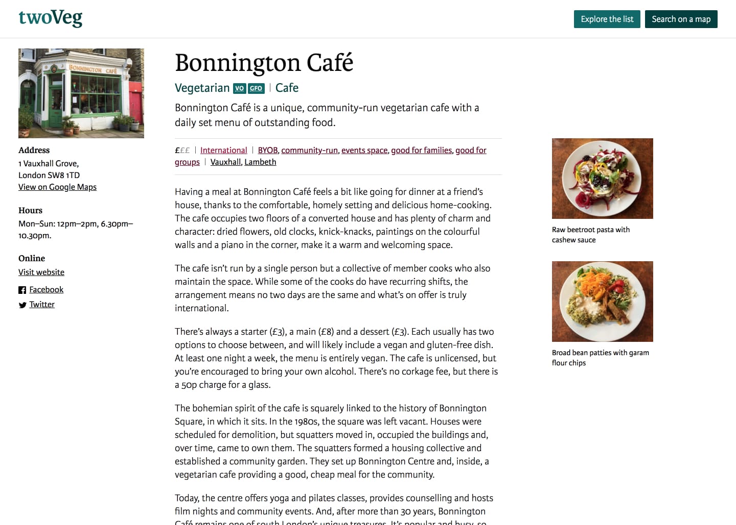
We carried out extensive research to compile a list of restaurants, cafes and market stalls that specialize in vegetarian or vegan food, and visited each one. For each place we included, we published a write-up that explained why it was worth a visit. The write-ups are backed by a database that we maintain and regularly audit, filled with opening times, addresses, contact details and the classifications we assign.
I designed the website by first looking at how a place appeared in a list, as a pattern, then explored how the patterns worked together and fit into the page. I built the website in WordPress, coding both the front- and back-end. The design process was inseparable from build, frequently revised and responsive to content changes.
Testing with our audience
Once the website had a substantial amount of published content, we began user testing. We found twenty people from our target audience: a mix of vegetarians, vegans and those looking to eat less meat. We asked everyone to explore the website and complete a questionnaire afterwards.
The questions were designed to check our assumptions about not only how the site was used, but our tone of voice as well. The feedback from testing helped us improve usability and validated many of our assumptions. It also confirmed a demand for our offering.
I continued to iterate the interface as we both wrote and published more write-ups. We launched the site with more than two dozen places on our list, with many more to come.